Fibonacci principles, derived from the Fibonacci sequence, can significantly enhance aesthetics in visual design by providing a framework for creating harmonious compositions and balanced layouts.
Here's how Fibonacci principles can be applied to enhance aesthetics in visual design, along with examples and tips:
1. Golden Ratio and Proportional Scaling:
The Golden Ratio, derived from the Fibonacci sequence, is a mathematical ratio of approximately 1.618. It is often represented by the Greek letter phi (Φ) and is found in various aspects of art, architecture, and design. Proportional scaling based on the Golden Ratio can create visually pleasing compositions with balanced proportions. Here's how this concept can be explained with examples:
Golden Rectangle and Harmonious Layouts
- The Golden Ratio can be applied to create Golden Rectangles, which have sides in the ratio of 1:Φ. These rectangles are considered aesthetically pleasing and can be used as the basis for layout composition.
- Example: Imagine a poster design where the dimensions of the canvas follow the proportions of a Golden Rectangle. By adhering to these proportions, the designer can create a layout that feels balanced and harmonious, with elements positioned in relation to the rectangle's proportions.
Proportional Scaling of Elements
- Proportional scaling based on the Golden Ratio can be applied to scale and position design elements within a composition. By following Golden Ratio proportions, designers can create balanced relationships between elements.
- Example: Consider a website layout where the size of the logo, navigation menu, and content sections are scaled according to Golden Ratio proportions. The logo might occupy approximately 61.8% of the width of the layout, while the navigation menu and content sections occupy the remaining 38.2%, creating a visually balanced composition.
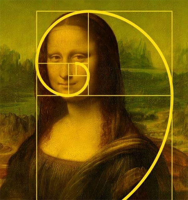
Golden Spiral and Focal Points
- The Golden Ratio can be used to create a Golden Spiral, which is a logarithmic spiral that grows according to Fibonacci numbers. This spiral can be used to guide the placement of focal points within a composition.
- Example: In a magazine layout, the Golden Spiral can be used to position key elements such as images, headlines, and call-to-action buttons. Elements positioned along the spiral's path receive more emphasis, creating a dynamic and visually engaging layout.
Typography and Text Layout
- Typography can be scaled and positioned according to Golden Ratio proportions to create visually pleasing text layouts. By applying the Golden Ratio to text elements, designers can establish balanced relationships between text blocks, headings, and body copy.
- Example: In a book design, the size and spacing of text blocks, headings, and margins can be scaled according to Golden Ratio proportions. This ensures that text elements are proportionally balanced and visually appealing, enhancing readability and aesthetics.
In summary, the Golden Ratio and proportional scaling based on Fibonacci numbers can be powerful tools in design, allowing designers to create visually pleasing compositions with balanced proportions and harmonious relationships between elements. By applying these principles to layout composition, typography, and visual hierarchy, designers can create designs that are aesthetically pleasing and engaging to the viewer.
2. Fibonacci Spiral and Layout Composition:
The Fibonacci Spiral, derived from the Fibonacci sequence, is a logarithmic spiral that appears in nature and can be used as a guiding principle in layout composition to create visually appealing designs. Here's how this concept can be explained with examples:
Natural Proportions and Harmonious Layouts
- The Fibonacci Spiral is based on Fibonacci numbers, resulting in a spiral that grows according to a logarithmic pattern. This spiral reflects the natural proportions and harmonies found in nature, making it an ideal tool for layout composition.
- Example: Imagine a website layout where the Fibonacci Spiral is used to position key elements such as the logo, navigation menu, and content sections. The spiral guides the placement of these elements in a way that feels balanced and harmonious, creating a visually appealing layout that captures the viewer's attention.
Focal Points and Visual Flow
- The Fibonacci Spiral can be used to establish focal points within a layout and guide the viewer's eye through the design in a natural flow. By positioning important elements along the spiral, designers can create a dynamic and engaging visual experience.
- Example: In a magazine spread, the Fibonacci Spiral can be used to position images, headlines, and text blocks in a way that leads the reader's eye through the pages. The spiral guides the reader's gaze from one focal point to the next, creating a seamless and captivating reading experience.
Dynamic Grid Systems and Modular Layouts
- The Fibonacci Spiral can inform the creation of dynamic grid systems and modular layouts that adapt to the natural proportions of the spiral. By aligning content with the spiral, designers can create layouts that feel organic and visually pleasing.
- Example: Consider a poster design where the Fibonacci Spiral is used to divide the layout into sections of varying sizes. Each section corresponds to a segment of the spiral, creating a modular layout that follows the natural proportions of the spiral. This approach results in a design that feels dynamic and visually interesting.
Hierarchy and Proportional Relationships
- The Fibonacci Spiral can help establish hierarchical relationships between elements within a layout based on their position along the spiral. Elements closer to the center of the spiral may receive more emphasis, while those farther from the center may serve as supporting elements.
- Example: In a website homepage design, the Fibonacci Spiral can be used to position the main headline and call-to-action button at the center of the spiral, drawing the viewer's attention. Secondary elements such as subheadings and images may be positioned farther from the center, creating a hierarchy of importance that guides the viewer's interaction with the page.
In summary, the Fibonacci Spiral can be a powerful tool in layout composition, allowing designers to create visually appealing designs that reflect the natural proportions and harmonies found in nature. By using the spiral to establish focal points, guide visual flow, create dynamic grid systems, and establish hierarchical relationships, designers can create layouts that are engaging, balanced, and aesthetically pleasing.
3. Grid Systems and Visual Hierarchy:
Grid Systems and Visual Hierarchy are fundamental principles in design that can be enhanced using the Fibonacci series.
Grid Systems
Grid systems provide a framework for organizing content within a design layout. These grids consist of intersecting horizontal and vertical lines that divide the space into columns and rows. Grids help designers align elements, create visual consistency, and establish hierarchy.
- Fibonacci Grids: Grid systems based on Fibonacci numbers offer an alternative to traditional grids. These grids are divided according to Fibonacci ratios, resulting in visually pleasing proportions. For example, a grid might have 13 columns (1, 1, 2, 3, 5, 8, 13) or 21 columns (1, 1, 2, 3, 5, 8, 13, 21).
- Example 1: In web design, a Fibonacci grid can be used to structure the layout of a homepage. The main content area might occupy a section based on the Fibonacci sequence, with smaller sections dedicated to sidebars, navigation menus, and calls-to-action.
- Example 2: In editorial design, a magazine layout can be structured using a grid system based on Fibonacci numbers, ensuring that text, images, and graphics are arranged in a visually appealing manner.
Visual Hierarchy
Visual hierarchy refers to the arrangement and presentation of elements within a design to convey their relative importance. By establishing a hierarchy, designers guide the viewer's attention, helping them navigate the content and understand its significance.
- Fibonacci Sequence and Hierarchy Fibonacci numbers can be used to create hierarchical relationships between design elements. Larger elements might be positioned according to higher Fibonacci numbers, while smaller elements occupy spaces based on lower Fibonacci numbers.
- Example : In editorial design, headlines, subheadings, and body text can be sized and positioned using Fibonacci ratios. The headline might be proportionally larger than the subheading, which in turn is larger than the body text. This creates a clear visual hierarchy that guides readers through the content.
Combining Grid Systems and Visual Hierarchy:
Grid systems and visual hierarchy work together to create well-organized and visually appealing designs. By aligning elements to a grid and establishing hierarchy using Fibonacci ratios, designers can achieve layouts that are both structured and dynamic.
Example: In poster design, a Fibonacci grid can be overlaid on the canvas to structure the layout. Important elements, such as the main headline or focal point, might be positioned at key points along the grid based on Fibonacci numbers. Supporting elements, such as images or secondary text, are then arranged around these focal points, creating a visually balanced composition that guides the viewer's eye.
In summary, Grid Systems and Visual Hierarchy are foundational principles in design that can be enhanced using the Fibonacci series. By applying Fibonacci grids and ratios, designers can create layouts that are visually pleasing, well-structured, and effectively guide the viewer's attention.
4. Asymmetry and Dynamic Compositions:
Asymmetry and dynamic compositions can be effectively achieved through the application of Fibonacci principles, particularly in design elements like layout and composition. The Fibonacci sequence offers ratios and patterns that can create visually appealing and balanced designs, even in asymmetrical compositions. Here's how this concept can be explained with examples:
Golden Rectangle and Asymmetrical Balance
- The Golden Rectangle, derived from the Golden Ratio, is a rectangle whose sides are in the proportion of the Golden Ratio (approximately 1.618:1). It's a visually pleasing shape that can be used to create asymmetrical balance in design.
- Example: Imagine a poster layout where the main image occupies approximately 61.8% of the vertical space, leaving the remaining 38.2% for text and other design elements. Despite being asymmetrical, this composition adheres to the Golden Ratio, creating a sense of balance and harmony.
Fibonacci Spiral and Visual Flow
- The Fibonacci Spiral, which grows according to Fibonacci numbers, can be used to guide the viewer's eye through a design in a dynamic and visually engaging way. Even in asymmetrical compositions, the Fibonacci Spiral can create a sense of movement and flow.
- Example: Consider a website layout where the Fibonacci Spiral is used to position key elements such as the logo, navigation menu, and call-to-action buttons. Despite the asymmetrical arrangement of these elements, the spiral guides the viewer's eye through the layout in a natural flow, creating a dynamic and engaging user experience.
Non-linear Scaling and Proportional Relationships
- Fibonacci ratios can be applied to scale and position design elements in non-linear ways, resulting in visually dynamic compositions. By following Fibonacci ratios, designers can create proportional relationships between elements that feel harmonious and balanced.
- Example: In a magazine layout, the size of images and text blocks can be scaled according to Fibonacci ratios. For instance, an image might occupy 55% of the width of the page, while a text block adjacent to it occupies 34% of the width, maintaining a proportional relationship inspired by the Fibonacci sequence.
Organic Forms and Natural Aesthetics
- Asymmetrical compositions inspired by Fibonacci principles can evoke a sense of natural beauty and organic harmony. By following Fibonacci ratios, designers can create designs that feel organic and visually pleasing, even in their asymmetry.
- Example: Consider a product packaging design where the placement of graphic elements follows the curvature of a Fibonacci Spiral. Despite the asymmetrical arrangement of these elements, the design feels cohesive and natural, reflecting the organic beauty found in nature.
In summary, asymmetry and dynamic compositions can be effectively achieved through the application of Fibonacci principles, which offer ratios, patterns, and proportions that create visually appealing and balanced designs. Whether it's the use of the Golden Rectangle, Fibonacci Spiral, non-linear scaling, or organic forms, Fibonacci-inspired asymmetry adds depth, movement, and visual interest to design compositions.
5. Color Harmonies and Fibonacci Color Palettes:
Color harmonies and Fibonacci color palettes can be enhanced by applying principles from the Fibonacci sequence, resulting in visually pleasing combinations that evoke balance and harmony. Here's how this concept can be explained with examples:
Proportional Color Distribution
- The Fibonacci sequence can be used to determine the proportions of colors within a color palette, creating a balanced and harmonious distribution of hues.
- Example: Consider a Fibonacci-inspired color palette consisting of five colors. Following Fibonacci ratios, the distribution of these colors might be as follows: 1 color occupies 38.2% of the palette, 2 colors each occupy 23.6%, and the remaining 2 colors each occupy 14.6%. This proportional distribution ensures that each color has a significant presence in the palette while maintaining overall balance.
Color Relationships and Complementary Hues
- Fibonacci-inspired color palettes can incorporate complementary hues based on Fibonacci ratios, resulting in harmonious color relationships.
- Example: Imagine a color palette consisting of two complementary colors. By following Fibonacci ratios, the primary color might occupy approximately 61.8% of the palette, while the complementary color occupies the remaining 38.2%. This ratio ensures that the colors complement each other while maintaining a visually pleasing balance.
Gradient and Transition Effects
- Fibonacci ratios can be applied to create gradient and transition effects between colors in a palette, resulting in smooth and visually appealing transitions.
- Example: Consider a Fibonacci-inspired gradient that transitions between two colors. By following Fibonacci ratios, the gradient might transition from one color to the other in a proportionally balanced manner, creating a seamless and visually pleasing effect.
Subtle Variations and Tints/Shades
- Fibonacci principles can guide the creation of subtle variations, tints, and shades within a color palette, resulting in nuanced and harmonious color schemes.
- Example: In a Fibonacci-inspired color palette, variations of a base color might be created by adjusting the saturation or brightness according to Fibonacci ratios. This approach ensures that the variations maintain a balanced relationship with the base color, resulting in a cohesive and visually pleasing palette.
Natural Inspiration and Aesthetic Appeal
- Fibonacci-inspired color palettes can draw inspiration from natural phenomena and aesthetics, resulting in colors that evoke harmony and beauty.
- Example: A Fibonacci-inspired color palette might be inspired by the hues found in a sunflower or a seashell. By applying Fibonacci ratios, the palette can capture the natural beauty and harmonious color relationships observed in these organic forms.
In summary, color harmonies and Fibonacci color palettes can be enriched by applying principles from the Fibonacci sequence. By following Fibonacci ratios, designers can create color palettes that exhibit balanced proportions, harmonious relationships, smooth transitions, subtle variations, and natural inspiration, resulting in visually appealing and aesthetically pleasing combinations.
By incorporating Fibonacci principles into visual design, designers can create compositions that feel balanced, harmonious, and aesthetically pleasing. Whether applied to layout, composition, color, or typography, Fibonacci-inspired design can enhance the overall aesthetics of a design and create a memorable user experience.